I’ve missed a few weeks of this very fun exercise, but I’ll give it a shot today – while it’s still Friday! Our assignment is to write for five minutes flat – no editing – on the topic for the week. And we all sign up over at Lisa-Jo’s place to share our very different responses to the same prompt. Check it out – I think you’ll like it a lot!
Today’s prompt is:
COLOR
GO:
I’ve spent most of this week elbow deep in color – Christmas color. Reds, greens, golds, silvers – all the rich, jewel-like tones that have come to symbolize this season of the year. I’m not done yet, either. The lights are on the tree, but the ornaments? That takes some doing and we’ll have to carve out a few hours tomorrow afternoon to get those beauties dangling.
I am a clear-color-lover. Don’t give me a dusky or muted palette – it will drive me to drink! I like lots of color around. Take a good look at the world in which we live most of the time. Is it not rife with glorious, eye-bending color collages? Yes, I think it is. And so, I revel in it.
But I’ll tell you this: as much as I enjoy adding all the razzle dazzle of this holiday season to my home, I am also very glad indeed to take it all down again in January. Why? Because I have come to love the colors we live with year-round – they speak to my heart of home and happiness and I miss them when they’re gone.
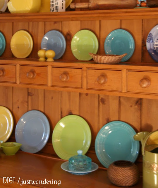
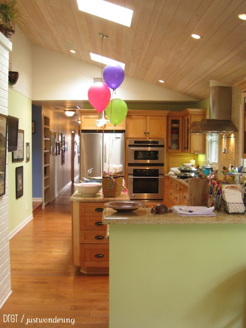
When we re-modeled our home about 4 years ago, I ordered new Fiestaware. I had never bought a set of dishes like this before and I was delighted to pick out: Sunflower, Turquoise, Chartreuse and Blue. They made me happy. So happy that I planned the entire renovation around my new dishes. And I’ve never been sorry. To me, these are the colors of creation – at least the parts of creation that resonate most strongly with my spirit. They speak of life and hope, of springtime and growth. And I LOVE being surrounded by varying shades of these 4 plus light-toned woods and white trim everywhere.
And people who visit seem to respond exactly the way we do – they tell me they feel happy and welcome when they get here. And that’s what it’s all about, right?
STOP








Love your decor and the color against the white.Nice contrast
When you said you’d planned your whole renovation around the sunflower, turquoise, chartreuse and blue, I thought it would be cheerful, but “not my thing” as I like soft palettes and monochromatics. But then I saw your photos and realized how you used the colours. It’s so tasteful and beautiful! A lovely home and one full of the warmth that fits you perfectly. 🙂
popping over from gypsy mama – your home definitely is cheerful and welcoming! simply lovely!
enjoyed reading.
Diana,
Your home looks like a place of welcome, a place of rest.
Exquisite.
I want to come snuggle up in your house! Love the reflections on color (I can so relate) and it was perfectly capped off with the soothing (so soothing!) colors of warmth and comfort in your house. So glad to see that glimpse of your life!
Your home is an inspiration! Beautiful! Your writing too!
Diana, what a beautiful home you have created! You have exquisite taste.
When my daughter got married 11 years ago, she and her husband chose Fiestaware and there are so many fun ways to use it.
I hope you’re enjoying this Christmas season. 🙂
Linda
Your home is beautiful! I love all the color as well!
Wow. Thanks, friends. We love our home and have just felt so happy with these colors everywhere. But it’s definitely not everyone’s cup of tea! So, thanks for your warm responses.
I have lots of disastrous stories I could share about over-using color in the earlier years of my adulthood. Believe it or not, this is much mellower and more toned down than other things I’ve done (or worn!) in my life. I did learn, over time and with a lot of mistakes made long the way, to choose softer shades (though not too many pastels…)and to stick to just a portion of the color wheel. :>)
Gorgeous! My favorite colors, Diana! I love how you called them the colors of creation. Would love to build my decor around them, too. Your couches are exactly the kind of comfy style and color with slipcovers…it’s what I dream of. And all those windows…and not far away, the sea. Sigh.